How to Ruin a Good Design in Canva and How to Fix It

Jacqui Naunton // White Deer
26 Jul 2024

Design principles may seem dry, but understanding them is crucial for creating professional-grade graphics that elevate your brand. When you fail to apply these principles, your brand suffers, impacting credibility and the perceived value of your offerings. In this tutorial, I’ll guide you through the common design pitfalls in Canva and how you can avoid them.

Step 1: Recognise the Importance of Design Principles

Design principles such as hierarchy, contrast, balance, and alignment are not just buzzwords. When applied properly, they enhance the professionalism of your graphics, making your brand more trustworthy and allowing you to stand out from competitors.

Step 2: Choose and Manipulate Canva Templates Wisely

  • Select Templates Aligned with Your Brand: Before choosing a template, consider how it fits with your existing branding. Opt for templates that reflect your brand’s aesthetic to streamline the design process.

Step 3: Use Professional Photography

  • Elevate Your Graphics with Professional Photos: Good photography can transform a design. If you can, invest in a branding photoshoot. If that's not an option, use well-lit and clear photos taken with your camera or phone.

Step 4: Adjust Text and Colour Contrast

  • Ensure Clear Visibility: Make sure your text stands out against the background. Check that there's enough contrast to make the text easily readable on small screens (like mobile devices).

Step 5: Align Text and Design Elements

  • Maintain Alignment for Cohesion: Proper alignment keeps your design looking clean. Use Canva’s alignment tools to ensure text and elements are not haphazardly placed.

Step 6: Prioritise Text Length and Layout

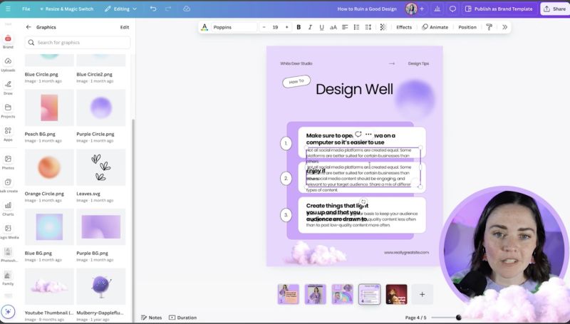
  • Avoid Overcrowding: If you have more text, adjust the design rather than just enlarging the text box, which can lead to a cramped appearance. Ensure there's enough margin and space.

Step 7: Choose Appropriate Templates

  • Match the Template with Your Content: Sometimes a template that looks great initially might not suit your content. Be ready to pivot and choose another that better accommodates your text and imagery length.

Step 8: Enhance Backgrounds for Better Readability

  • Consider Background Colours: Ensure your text remains legible by choosing backgrounds that complement the overall design without overpowering it.
Support Jacqui Naunton // White Deer

Your support helps me produce more content like this. If you enjoy the content I make - like, follow or subscribe!

Subscribe on YouTube

By understanding these steps and applying the core design principles effectively, you'll avoid common pitfalls and ensure that your brand represents the professionalism and attention to detail your business deserves. Keep practising, and don't hesitate to tweak your design elements for the best outcomes. Happy designing!

Jacqui Naunton // White Deer