


Designing your own business graphics can be a cost-effective and empowering journey, especially with tools like Canva at your disposal. However, it's easy to fall into common pitfalls that can make your DIY graphics look amateurish rather than professional. As a graphic designer, I've observed several frequent mistakes that, when avoided, can drastically improve your design quality. This tutorial will guide you through these pitfalls and how you can achieve a polished, cohesive look for your business graphics.
Whether you're creating social media posts, flyers, or business cards, your design speaks volumes about your brand. By avoiding these common mistakes, you'll ensure your graphics are not only visually appealing but also effectively communicate your brand's message and values.
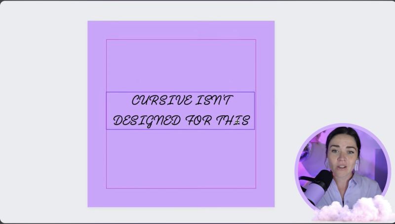
Cursive fonts can add elegance and personality to your graphics. However, using cursive fonts in all uppercase is a common error that diminishes readability. Cursive is meant to flow gracefully, and when forced into uppercase, it loses its readability and aesthetic. Always pair cursive fonts with lowercase letters or consider a different style if uppercase is necessary.
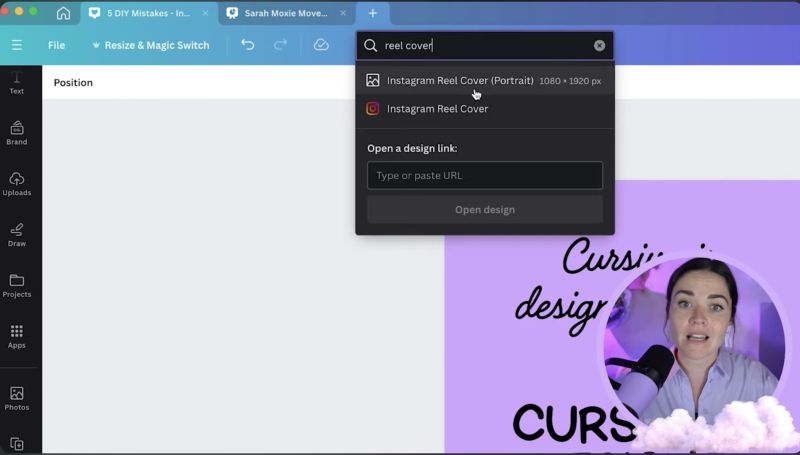
Using the wrong-sized graphics can impact both the quality and the appearance of your design. Whether it's a poster or a digital banner, every platform and medium has recommended dimensions. Using sizes that match your design's intended format maintains quality and ensures it displays correctly. Canva often suggests these sizes, so take advantage of this feature to streamline your process.
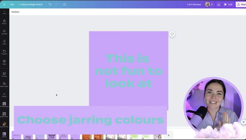
Colours play a crucial role in design. Clashing or overly similar colours can make text unreadable or graphics unappealing. Aim for a balance of contrasting tones to ensure text stands out while maintaining aesthetic harmony. Test your palette by pairing colours directly to check readability and visual appeal before finalising your design.

Your support helps me produce more content like this. If you enjoy the content I make - like, follow or subscribe!
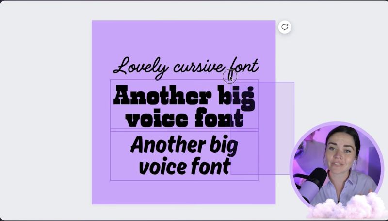
Selecting fonts that complement each other is vital for maintaining a professional look. Fonts with distinct personalities can clash, creating a jarring effect. Limit your design to two or three fonts, ensuring that if one has a strong personality, it's balanced by simpler, low-voice fonts that harmonise with the overall design.
Leaving adequate space or "margin" around your design elements is essential for readability and aesthetics. It prevents your design from appearing cluttered and guides the viewer's eye naturally through the content. Ensure margins are consistent around all elements, and avoid the trap of filling every space with text or graphics.

The overarching theme to professional design is consistency. Apply the same fonts, colours, and style elements across all your graphics to create a cohesive story for your brand. Consistency builds recognition and trust with your audience, reinforcing your brand's identity and message.
---
By following these steps, you can transform your DIY approach into a professional result that resonates with your audience. Remember, thoughtful design choices make a significant impact on how your brand is perceived. Happy designing, and may your graphics truly shine!
Jacqui Naunton // White Deer